
In a world overflowing with digital noise, how do you make a real, lasting connection? It starts with a handshake and a business card that feels so good in their hand, they can't bring themselves to toss it. Ordering the right business card isn't just about printing your contact details; it’s about creating a powerful, pocket-sized piece of your brand that demands to be noticed. This guide will walk you through every step to ensure your card makes a tangible, memorable impact.
Why a Great Business Card Still Matters

With inboxes overflowing and social media feeds buzzing, the simple act of handing someone a business card cuts through the digital clutter. It's a physical touchpoint—something real they can hold onto long after your conversation ends. This isn't just about sharing an email; it's about cementing a professional connection and reinforcing your identity.
Imagine you've just spent a day at a bustling trade show. A potential lead gets back to their office with a stack of cards. Which one will they remember? Not the flimsy, forgettable one. It will be the card with a unique texture, a striking design, or a premium weight—the one that makes them think, "this is a company that pays attention to detail."
The Lasting Impact of a Physical Connection
A well-designed business card acts as a silent salesperson, sitting on a desk or pinned to a board, keeping your brand visible. That constant, subtle presence is a surprisingly effective way to build brand awareness and stay on the radar of potential clients.
The numbers prove it. For every 2,000 business cards handed out, a company can see a sales increase of 2.5%. Even more impressively, printed cards often boast a 12% conversion rate, towering over the typical website conversion rate of just 2.35%. They remain a cost-effective marketing powerhouse for good reason.
A business card is more than just paper; it's a strategic handshake. It’s your brand’s first physical impression, and in business, first impressions are everything.
Taking the time to order business cards that truly reflect your brand's quality isn't an expense—it's an investment in creating meaningful opportunities.
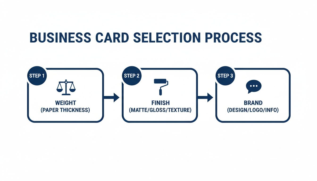
Choosing the Right Paper Stock and Finish
The moment you hand someone your business card, you're handing them a piece of your brand. The weight, texture, and feel all send a message before a single word is read. This is your most tangible chance to show you care about quality.
Think of paper weight as a signal of substance. It's measured in GSM (grams per square meter). A flimsy, low-GSM card feels instantly forgettable, but a solid 350gsm stock feels professional. For a real statement, upgrading to a premium 450gsm stock gives your card a noticeable heft that tells the recipient you don't cut corners.
Selecting the Perfect Finish for Your Brand
The finish you choose completely changes the vibe of your design. It's a crucial part of ordering business cards that truly work for you. Here’s a quick rundown of popular choices:
- Matte Finish: Smooth, non-reflective, and modern. It’s perfect for minimalist designs and has a huge practical advantage: you can easily write on it.
- Gloss Finish: High-shine and reflective, this finish makes colours pop. It's the go-to for designs heavy on photos or vibrant hues.
- Soft-Touch Finish: A game-changer with a unique, velvety texture that feels like suede. It's a surprising and luxurious touch that makes people pause and makes your brand instantly more memorable.
A business card's finish isn't just a protective layer; it's a sensory detail that defines how people perceive your brand. A matte finish feels sophisticated and understated, while a gloss finish feels bold and energetic.
A creative agency might lean into a soft-touch finish to communicate an innovative feel, while a corporate consultant would likely choose a classic matte finish for its timeless, professional look.
Business Card Stock and Finish Comparison
This quick reference guide can help you choose the best paper and finish for your brand's needs.
| Feature | Best For | Considerations |
|---|---|---|
| Matte Finish | Minimalist designs, corporate branding, and cards you need to write on. | Can make dark colors appear slightly less saturated compared to a gloss finish. |
| Gloss Finish | Photo-heavy designs, bright colors, and brands wanting to make a bold impact. | Prone to fingerprints and glare; impossible to write on with a standard pen. |
| Soft-Touch Finish | Luxury brands, creative professionals, and anyone wanting a memorable, tactile experience. | Often a premium option, so it can be more expensive. Best for designs with simple, clean lines. |
Ultimately, the goal is to create a card that feels authentic to your brand and makes a lasting impression.
Practical Tips for Paper and Finishes
Your choice needs to be practical. If you might need to jot down a note on your card, always choose a matte finish. Trying to write on a glossy or soft-touch card is a frustrating, smudgy mess.
It also helps to think beyond the card itself. Consider how your logo on a notebook looks with a certain texture—that can give you clues about how it will translate. For more inspiration, you can find insights into various paper options for stunning prints to help inform your decision.
Getting Your Design Ready for a Flawless Print Run
A fantastic business card design can quickly turn into a printing disaster if the file isn’t set up correctly. This pre-flight checklist will bridge the gap between your digital screen and the final, physical card, saving you the headache of a reprint.
Nailing the Print-Ready Essentials
Let's cut through the printer jargon. Three terms are absolutely critical: bleed, trim, and the safe zone. Picture them as three invisible borders on your design.
- Safe Zone: The heart of your card. All your most important stuff—your name, logo, and contact details—must live comfortably inside this area to guarantee nothing gets chopped off.
- Trim Line: This is exactly where the card will be cut to its final size.
- Bleed Area: If a background color or image runs to the edge, you must extend it past the trim line into this outer margin. This small overlap prevents ugly white slivers from appearing.
Getting the design file right is just one piece of the puzzle. The whole process, from the paper's feel to the final finish, is about making intentional choices that reflect your brand.
As you can see, creating the perfect card is a balancing act between the physical weight, the visual finish, and the message your brand is sending.
Key Technical Specs for Your Artwork File
Beyond placement, the file itself must meet non-negotiable standards. It's always worth checking a printer's comprehensive artwork guidelines, but here are the essentials:
- Resolution: Must be 300 DPI (dots per inch). A 72 DPI logo pulled from a website will look pixelated and fuzzy when printed.
- Color Mode: Must be CMYK (Cyan, Magenta, Yellow, Key/Black). RGB is for screens, and the color shift during conversion can be jarring.
Expert Tip: The single most common mistake is a low-resolution logo. It might look fine on your website, but print is a different beast. Always use a vector file format (like .AI, .EPS, or .SVG) for your logo to ensure it's perfectly crisp.
Dodging Common Design Pitfalls
A few common mistakes pop up time and again. Tiny text is a big offender; anything below an 8pt font can become hard to read. When in doubt, bump it up a point. Thin borders around the edge are also risky, as even a slight shift during cutting can make them look uneven. It's often safer to design without them.
Placing Your Order: Nailing the Quantity and Timing
Your design is locked in. Now, how many cards do you actually need? Getting the quantity right is a balancing act between your budget, your schedule, and being ready for anything.
Think about your day-to-day role. A real estate agent might need hundreds per month, while a consultant may only need a few. A salesperson heading to a huge trade show could burn through 500 cards in a few days. Your role is the best guide.
Finding the Sweet Spot: Cost vs. Quantity
Printing is all about economies of scale. The initial setup carries a fixed cost, so the price per card drops dramatically as your order quantity goes up. This is why ordering 500 cards often feels like a much better deal than ordering just 250.
Ordering in bulk isn't just about saving money; it's about saving future you from a headache. Having a solid supply on hand means you’re always ready for that unexpected meeting without scrambling for a rush order.
However, don't order 10,000 just for the discount. If your title, phone number, or branding might shift in the next year, a smaller order is the smarter play. You can also think strategically about your budget by exploring tips for saving on promotional products.
Turnaround Times and Delivery Planning
Finally, let's talk timing. Our standard turnaround is great for routine restocks, but what if a trade show is just three days away? That’s when our express options become a lifesaver. Yes, they cost more, but expedited production and shipping can prevent a crisis.
The best way to avoid stress is to plan ahead. If you know a big conference is coming up in two months, that’s your cue. Place your business card order then, and you’ll have plenty of breathing room.
Making a Statement with Custom and Eco-Friendly Options
A standard rectangular card gets the job done. A custom card gets remembered. Unique features and sustainable choices make your brand stick, turning a quick handshake into a real connection.
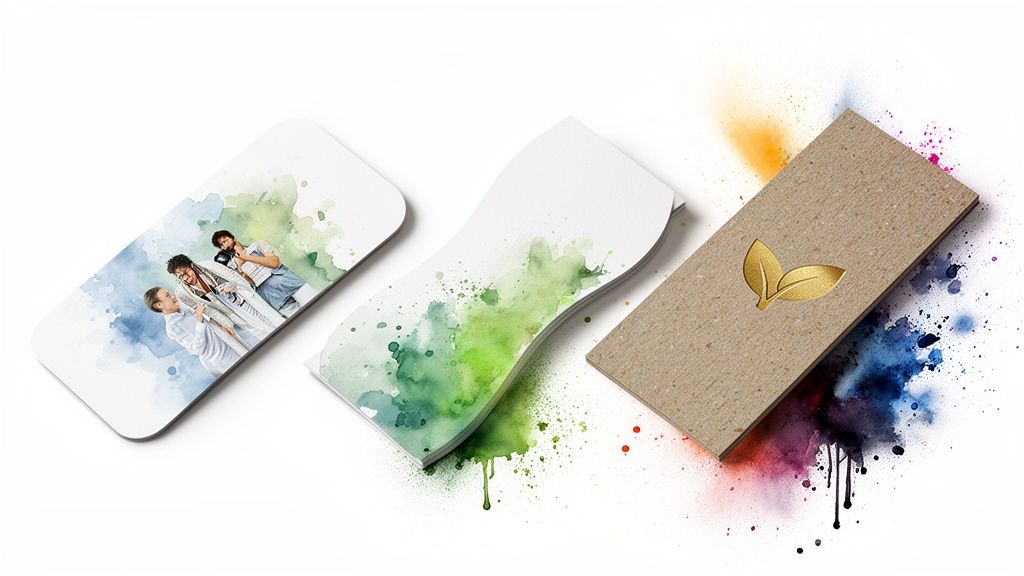
The data backs this up: searches for custom business cards shot up by 144% in a single year. Businesses are tired of the cookie-cutter approach and are actively seeking cards that reflect who they are.
Elevate Your Design with Premium Finishes
Special finishes add a tactile element that instantly communicates quality. Here are a few options that work wonders:
- Rounded Corners: A small change that softens the card's look for a more modern and friendly vibe.
- Foil Stamping: Adds a brilliant metallic pop to a logo or text, perfect for luxury brands.
- Spot UV: Applies a glossy varnish to specific areas while the rest stays matte, creating a subtle, elegant contrast.
- Die-Cut Shapes: A custom shape, like a coffee cup for a café, makes your card truly unforgettable.
A custom finish is a conversation starter. When someone feels the raised texture of spot UV or sees the glint of foil, they’re not just holding your details—they’re experiencing your brand’s commitment to quality.
Showcasing Your Commitment to Sustainability
These days, corporate responsibility is a core expectation. Your business card offers a tangible way to show what your brand values, and opting for eco-friendly materials speaks volumes.
The demand for sustainable products is only growing. At Persopens, we offer several recycled paper stocks that feel premium, paired with vegetable-based, eco-friendly inks. It's more than a printing choice; it's a statement about what your brand stands for. You can explore more ideas in our guide to eco-friendly promotional products.
The Final Check: Proofing Your Design Before It Goes to Print
This is the most critical step. Before we print your cards, you’ll get a digital proof. A single transposed digit in your phone number can turn a brilliant design into a box of expensive recycling.
Resist the urge to give it a quick glance and click approve. After staring at a design for hours, your brain sees what it expects to see, not what’s actually there.
Your Essential Proofing Checklist
Be methodical. Go through a checklist to catch those sneaky errors.
- Contact Details: Is every digit of your phone number correct? Is there a typo in your email or website URL?
- Spelling & Grammar: Read every single word out loud. This forces you to slow down and catch things you'd otherwise miss.
- Logos & Images: Make sure your logo isn't too close to the trim line. Are your images sharp and clear?
- Layout & Alignment: Does everything look balanced? Is anything cramped or awkwardly spaced?
If I can give you one single piece of advice, it's this: get a second pair of eyes on your proof. Grab a colleague or a friend. They will almost instantly spot an error you've been blind to for days.
A Quick Word on Color: Screen vs. Print
It's important to have the right expectations about color. What you see on a bright, backlit computer screen (RGB) will never look exactly the same when printed with ink (CMYK). This isn't a mistake; it's the physics of light versus pigment. Blues might print a touch darker, and vibrant greens can look more muted. Knowing this ahead of time is key to being thrilled with the final result.
Summary: Crafting the Perfect Business Card
Ordering the right business card is a strategic process that pays dividends. By focusing on a few key areas, you can transform a simple piece of paper into a powerful marketing tool.
Here's what we've covered:
- Understand Why They Matter: A physical card cuts through digital noise and creates a memorable, tangible connection with a high conversion rate.
- Choose Quality Materials: Select a paper weight (like 350gsm or 450gsm) and a finish (Matte, Gloss, or Soft-Touch) that reflects your brand's personality and quality.
- Prepare a Flawless File: Ensure your design uses 300 DPI resolution, CMYK color, and proper bleed and safe zones to avoid printing errors.
- Order Strategically: Balance cost-effectiveness with your actual needs, and plan your order timing to avoid rush fees.
- Proof with Precision: Meticulously check every detail on your digital proof—and have a colleague check it too—before giving the final approval.
By following these steps, you're not just ordering business cards; you're investing in a powerful first impression that will open doors and build lasting professional relationships.
Ready to create a business card that truly stands out? The team at Persopens is here to guide you through every step. Start your order today and make a lasting impression.


0 comments